Showing posts with label demonstration. Show all posts

Friday, June 18, 2010

Simplifying Mass Shapes

Before focussing on the details and extra "stuff" in a painting, I first try to focus on the mass shapes and values...the simple [or not so simple] elements that make up the structure of the composition. As noted from my previous post, I have divided my landscape into 3 mass shapes of light (sky), middle (foreground pavement), and dark (mid-ground treeline) value. Breaking down the scene into abstract shapes, I am assigning color to those mass value shapes, disregarding (attempting to anyway) the smaller value and color accents.
These value masses, serve as a reference to relate other values in the painting. Now I can expand on the mass shapes, adding subtle value, color, and temperature accents. Supporting the value structure (and perspective) identified in my thumbnail sketch, will enhance the paintings overall "readability."

"The most important ally in the study of painting is the art of thinking."
Edgar Payne's Composition of Outdoor Painting

Friday, March 19, 2010

The Chair...take two

A few months ago I painted a small study, cropped version of a chair, junk out in "the yard". This week I am repainting that chair as a demonstration for a beginning watercolor class. For the "take two" larger version (16X20), I introduced an expanded palette of colors to include warmer tones in relation to what will be the "coolness" of the shadow. Placing warm intense color in front of cooler, less intense color will visually "push" the warmer shapes forward, creating an illusion of depth. "Chair" finale...coming soon.

Friday, November 13, 2009

Visual Summary

As an artist, one of my tasks in creating a painting is to simplify and translate the essence of a subject as I see it in that moment on any given day. During my pastel workshop this week, we had a discussion on "simplifying," and as one of my students aptly stated "creating a visual summary". The concept seems "simple" enough. However, beginning painters often become distracted with and jump right into painting the details, forgetting that value and form are the "batter and cake" in a painting; essential for it's foundation, success, and "readability".
So, a few tools and questions I use to know what "detail" to include in my visual summary: 1. Begin with a thumbnail sketch. Value sketches are useful in helping you simplify your design into only shape, value and form. 2. Squint your eyes and look at your image. The values in shape and form are the "cake", everything else just "frosting". 3. Which details (usually line or texture) are important to enhance the visual flow and underlying compositional structure? 4. Is the detail important to overall "readability" of the painting? If not, I leave it out. 5. Much of painting is illusion and "special effects". I will often hint at the detail (usually with texture, a few gesture lines, or direction of the pastel application) without actually drawing it in; the viewer's eyes will fill in the rest. For example: in my garlic painting, I use the line of shadow shapes to create movement and flow, visually directing the viewer through the painting ("readability"). The trapped areas of detail and texture (which are really, just less blended areas) at the buds of the garlic also direct (and pause) visual movement. My goal... to support the underlying armature (see previous posts).

Friday, October 30, 2009

Healthy dose of reality...I mean realism.

I find creating "realism" in a painting helps ground and settle me in the present. Realism on a 2D surface is nothing but "special effects"... i.e. simply drawing with value and color perspective.
For this "breath of fresh - garlic", I have chosen a neutralized complimentary color scheme of "oranges" and "blues". Considering color harmony, I will keep my palette simple, choosing only a few colors within my color scheme that represent a variety in value (lights, darks, and midtones), softness, temperature (warm and cool colors) and chroma (intensity).
Form and value in painting are built by layering pastel of various hues and color temperature. Most often, I will work spatially, working an area as it occurs in space on the 2D plane. I begin with the most distant space and work towards the most forward space. That said, I continuously go back and make minor adjustments to previously worked areas to balance the colors and values throughout the painting. In general within these spaces, I work from dark to light and harder to softer pastel.
Studying the light as it falls on the subject, I first lay in the darker and "cooler" color followed by the warmer darks. I consider this the foundation darks, followed by the lighter, softer color "on top". By accurately portraying these values, form and depth are created (and thus the "special effects" of painting).

Sunday, October 25, 2009

Before the drawing...

Quite a bit of planning occurs before I begin the drawing for a painting. I have found that I am much more successful with a painting when I have organized and done a little prep-work first. Thumbnail sketching is often a part of my initial planning. Small sketches can be great tools to help you simplify the abstract areas in your design, determine a structure for your composition (if desired), better understand the value and shape relationships, and explore possibilities in design before committing to it in your final painting.
A few tips for thumbnail sketching: Keep your sketches small and simple. They should only take about 5 min each to complete. Don't worry about details, just focus on a pleasing arrangement of shapes and values. Above, I am generalizing mass areas and identifying the areas of lights and darks. I ask myself...Do I want to follow a design structure (or armature) for my painting? Where are the areas of lightest lights and darkest darks? How can I use these shapes to enhance the design of my painting? How will I use these lights and darks (and line direction) to create movement in the painting? How will the viewer's eyes travel around the painting (passage)? Do I have (and want) a focal point?
One of the most exciting aspects of painting for me is finding order in apparent randomness, especially in life and snapshots of everyday moments. For this reason, I don't "stage" my still-life paintings. I find order in what is already there. For example, the garlic above was a photo from the farmer's market near my studio in Fredericksburg. Armatures serve as the backbone structure of a painting, will help create a coherent flow, and are a starting point to determine placement of shapes, values, and color. The disclaimer here... not all paintings need to have a structure to be successful and not all compositions lend themselves to structure (i.e. single-object still life, continuous field compositions, portraits, etc), but many do. Above are a few common compositional structures. Again, these structures are simply guides, not rules, and for beginning painters, will provide a direction in helping you organize and be more successful with your paintings.

Thursday, October 22, 2009

How to...draw using a grid.

Over the past few years, I have taught many beginning artists in various workshops. I have found that one of the most difficult and frightening aspects of starting a painting is the drawing. For most of us, being confident in the initial drawing is critical to how we will feel about our work at completion. So in teaching a workshop (whether it be watercolor or beginning in pastel), I just can't get around the first class: where to start with a drawing and how to design and craft a painting. Over the next few blog entries, I thought it would be helpful to post a few tips I follow that will help beginning artists be more successful in their paintings.
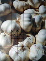
For students who have never drawn, creating a grid is one useful way to help you determine size, angle, and foreshortened relationships and perspective. If working from a reference, your first step will be to find the right proportion for your enlarged sketch (grid). I do this by laying the reference to the lower left corner of piece of sketch paper (large enough to fit your working surface). Draw a diagonal from the lower left corner to the top right corner. Any place on this diagonal that you draw 2 perpendicular lines, the rectangle will be proportional to your reference. This is the area you will use as your format for the larger painting and the area that will correspond to your grid.
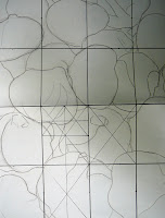
Admittedly, there are many ways to make a grid. I will typically divide the paper and reference in half, 1/4 point and 3/4 point both vertically and horizontally. The one rule... the grid should be the same in both your reference and your enlarged paper. You can further divide you grid as many times as necessary. My goal here is to simply create an accurate line drawing to work from while painting. I will often revise my drawing as I go to fit what works for the painting. Most of the drawing is done with value and form in pastel. However, if my initial proportions are off, then I will never be able to accomplish what I want with value and form. Tip: I will place my reference in a sheet protector and create the grid on the plastic with a sharpie. This way, I can take the photo out later and see it without the distraction from the grid.
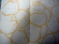
Once I have a drawing I am confident in, I will turn the paper over, cover the lines with graphite (for a watercolor) or hard pastel. Then I will lay the sketch paper over my painting surface (pastel side down) and retrace my initial sketch. Only the pastel sketch will be left on the surface and I am ready to start, almost...

Wednesday, July 15, 2009

Poppies, In Progress

Reds are in, centers started. Now, what to do with the background? I have painted a few ideas in a sketchbook. I want a background that will maintain the integrity of the painting and contribute to the "mood" of the subject. A little history about the poppy...
The poppy, by nature, is a wildflower. It’s seed will lie stagnant in the ground until it is disturbed. During times of war, soldiers would, inadvertently, churn ground as they marched though fields. The result was a beautiful and overabundant growth of poppy flowers found to flourish in conditions where most other flowers would die.

Monday, June 8, 2009

Painting on Yupo, Workshop Day 2

In today's "Watercolor on Yupo" workshop, I painted the background (and some foreground) for what will be a water lily flower. The paint for the background was applied using a "soupy" mix of paint, pulling from puddles of Perylene Green, Winsor Green, Indigo, and Dioxazine Purple. I allowed the colors to loosely mingle by dropping in water and pushed around the darks with a paintbrush to create forms until the paint dried. For painting these rich darks, I have recently began using the PBk31 pigment, Perylene Green. After researching this pigment (www.handprint.com, my most used reference for researching pigment), I have discovered that Perylene Green falls into the family of "Black" pigments. And now that I have been using it, I don't know how I ever got along without it. Perylene green is very lightfast (rated 1 for excellence), semitransparent, staining, very dark valued pigment.

Monday, June 1, 2009

Balloons on Yupo


Today I demonstrated two paintings for a "beginning techniques" exercise in the "Watercolor on Yupo" workshop. Yupo is a manufactured synthetic paper made from recycled plastic. The surface is nonabsorbent and so requires some variation from traditional watercolor methods. Watercolor painted on yupo creates unusual "fluid" effects. For beginning techniques, we practiced various methods for applying the paint on yupo, subtracting paint, and creating cascading variegated and flat washes. To see a few more of my paintings on yupo, visit my website gallery.

Thursday, May 14, 2009

Painting "Green" Workshop, Day 2


This is a small painting I am demonstrating for my class this week on "Painting Greens". I am using the "greens" color chart from last week to guide my color choices for particular leaves, considering the "warmness and coolness" of each leaf, intensity, and value in relation to each other. My goal at this step is to begin to develop the perspective with color and paint a variety of warm and cool greens for interest. Next week, I will work to unify the greens, glaze to continue to "push and pull" leaves for overlapping, and strengthen the values.

Tuesday, March 17, 2009

Creation Declares!

Creation Declares!
Watercolor on Arches 300lb paper
Unframed (for now)
Sold

I must admit something... I was happier with the computer image more than the actual painting. Sometimes, when the image is condensed into a digital picture, the reds and magentas just seem to "pop". So I went back and restated the orange/ pink/ reds with more intense color (my favorites: Permanent Rose and Quin. Sienna). Painting "white," high key, delicate paintings just doesn't feel natural for me. I prefer high contrast, "punchy" color. For the background, I used the dark green to add direction to the painting and unify the flowers. I also included negative space painting stems to add another layer of dimension.

Monday, March 9, 2009

Painting "White", Workshop Demonstration 2

Today I began developing the midtone values in the flowers and working through the background. I glazed in a neutral violet (dilute Winsor Violet + Rose Madder Genuine) for the "behind" flowers, pulling the top flowers forward with negative space painting (painting behind the flowers). On the flower to be painted, I dampened the area on the pedals and then touched in the color, grading out the wash with clean water. Using a mix of Quin. Gold and New Gamboge, I added a layer to the flower centers developing the round shape. I varied the soft and hard edges. When working on the forward flowers, I used a warmer pink mix, leaving more white on the flower. I will continue this process of pushing and pulling flowers working around the painting. I also began to work the background, using a wet-into-wet wash of darker green (adding Winsor Green) and mingle of yellows (see right corner). I will continue this process through the background for unity.

Tuesday, February 24, 2009

Painting "White" Demonstration 1


Above are the two paintings demonstrated in the current "Painting White" watercolor workshop.I have begun the first layer of lightest tones in the flowers using wet-into-wet application of rose madder genuine + winsor violet + viridian + some yellow mix of Aureolin, New Gamboge, and Quin. Gold. The flower area was dampened randomly with clean water, then RMG and WV brushed in and allowed to diffuse. Some Viridian + yellow mixed to make a warm green and added as the half-tone (next-to-lightest value) to compliment some of the pink "white" areas of the pedals. While still damp, the yellows were painted in the centers leaving small dry spots to create some texture.
The "background" flowers were painted slightly darker and more neutral than the forward flowers. I will complete the flowers throughout the painting repeating this first step and then begin the first step of light values in the background.
For the background, I am choosing to use the same color palette as I used for the flowers. (This may change with later glazes/ layers). I first dampen the area of the background to be painted and then brush in my transparent glazing colors; Aureolin, followed by RMG and Viridian. I rotate the paper and allow the pigment to mingle. When doing the background, I consider my initial value sketch, where the light source is coming from and how the background will unify the shapes.

Wednesday, December 17, 2008

Fall Leaves, In Progress 3

I mounted the two paintings to Ampersand Clayboard. I first covered the sides of the wood cradle to protect it from the medium. Then I dampen the back of watercolor paper and apply a generous layer of soft gel medium to the clayboard. I lay the paper over the clayboard and press out any air bubbles. Because the paper and clay are absorbent, they soak up the medium and form a firm bond. I let the painting dry overnight, face down, keeping something heavy (in this case a brick) on the back.
Once the painting is dry, I remove the the tape around the edges and trim the excess paper using a razor blade. The edges are then sanded until smooth.
Now that the paintings are mounted on the clayboard, I will paint metallic embellishments and then varnish the two paintings.

Saturday, November 22, 2008

Visiting Artist Workshop at Fredericksburg Academy


On Friday, I taught a watercolor workshop at Fredericksburg Academy for two classes of fabulous Fourth and Fifth graders. I demonstrated the steps for the above two 4X6 paintings in each class. Then the kids followed along with their paintings. We drew our sea animal pictures in pencil and then applied liquid masking fluid over the pencil line. Once the masking fluid was dry, we watercolor painted using wet-on-wet technique to create the ocean background. For some, we added salt for texture. Once the paintings are dry, the masking fluid (and salt) is removed leaving a white outline of the initial drawing.
This workshop is part of the Liberty Town Visiting Artist Program created by Mirinda Reynolds. Mirinda is the lower school art teacher for Fredericksburg Academy (and my wonderful studio-mate at Liberty Town, not to mention a brilliant oil painter). The program hosts a guest artist to lecture and demonstrate the last Friday of each month. The children are able to ask questions and participate in a short project taught by the visiting artist.
I had such a great time sharing this technique with the kids, helping them create their mini-masterpieces, and being a part of their creative energy. Thank you Fredericksburg Academy!

Tuesday, November 18, 2008

Fall Leaves Workshop Demonstration 3

I have added some key darks to create the illusion of layering. I used a deep maroon dark to unify the painting. I also added a few details by lifting out leaf veins, painting some in, and negative space painting. I love the motion and energy in this painting.

Tuesday, November 11, 2008

Fall Leaves Workshop Demonstration 2

This is second of the leaf demonstrations. I started with an underpainting of Aureolin Yellow and Permanent Rose and then layered the leaves after I applied paint to the vein side. Once dried, the leaves left a more vague imprint than with the first painting. I will need to paint in the leaf shapes more directly.

Using a combination of techniques including negative space painting and direct painting, I have begun to add layers to the leaves; pushing some behind, pulling some foreward. Some leaves are painted in directly, while others are painted around (painting the negative space).

Tuesday, November 4, 2008

Fall Leaves Workshop Demonstration 1

For this demonstration, I started with an underpainting on damp paper and glazed in Aureolin Yellow, Permanent rose, and Quin. gold. With the underpainting, I am beginning to create direction and movement within the painting. I then paint the leaves individually and place them on the damp paper. I layer and place the leaves according to my design plan, considering which leaves will later be forward and which will be behind. Then I leave the painting until the paper is completely dry. When the leaves are removed, I am left with visual texture and varied hard and soft edges. Later, I will use these to develop the painting.

Friday, October 31, 2008

Standing Tall

Standing Tall,
Demonstration from Watercolor Workshop
Watercolor

Wednesday, October 29, 2008

Sunflower Demonstrations

I have put in the background and will continue to adjust the value relationships between the sunflower face and background. I have painted additional glazes of quin.gold plus magenta on behind pedals and begun to add more hard edge details and shadows to the forward pedals.