Tuesday, November 24, 2009

What a Steal!

Join me for a very special night at the Workhouse Arts Center, Saturday Dec 12th.
Each year the studio and associate artists at The Workhouse help with a fundraising event called the Collector’s Showcase. I am inviting you to attend this event on December 12, 2009 and help me support the Workhouse and all of its programs. Art collectors and patrons buy a $150 ticket to the event where they enjoy wine tasting, music and best of all they get to select an original piece of artwork and take it home from a collection of over 100 pieces that have been donated by artists at The Workhouse.

Pelican Party up for auction for a $150 ticket!

Tuesday, November 17, 2009

Friday, November 13, 2009

Visual Summary

As an artist, one of my tasks in creating a painting is to simplify and translate the essence of a subject as I see it in that moment on any given day. During my pastel workshop this week, we had a discussion on "simplifying," and as one of my students aptly stated "creating a visual summary". The concept seems "simple" enough. However, beginning painters often become distracted with and jump right into painting the details, forgetting that value and form are the "batter and cake" in a painting; essential for it's foundation, success, and "readability".
So, a few tools and questions I use to know what "detail" to include in my visual summary: 1. Begin with a thumbnail sketch. Value sketches are useful in helping you simplify your design into only shape, value and form. 2. Squint your eyes and look at your image. The values in shape and form are the "cake", everything else just "frosting". 3. Which details (usually line or texture) are important to enhance the visual flow and underlying compositional structure? 4. Is the detail important to overall "readability" of the painting? If not, I leave it out. 5. Much of painting is illusion and "special effects". I will often hint at the detail (usually with texture, a few gesture lines, or direction of the pastel application) without actually drawing it in; the viewer's eyes will fill in the rest. For example: in my garlic painting, I use the line of shadow shapes to create movement and flow, visually directing the viewer through the painting ("readability"). The trapped areas of detail and texture (which are really, just less blended areas) at the buds of the garlic also direct (and pause) visual movement. My goal... to support the underlying armature (see previous posts).

Friday, November 6, 2009

One Garlic [breath] at a Time

As I work, I am continuing to balance the variety of "warm and cool" color along with considering value and color perspective as I define the forms and space: lighter values, intensity of color, and warmth appear forward; darker values and cool colors visually recede. I also enjoy the interplay of lost and found edges that contribute to the illusion of "real" and aid the viewer's eye to travel around the painting.

Friday, October 30, 2009

Healthy dose of reality...I mean realism.

I find creating "realism" in a painting helps ground and settle me in the present. Realism on a 2D surface is nothing but "special effects"... i.e. simply drawing with value and color perspective.
For this "breath of fresh - garlic", I have chosen a neutralized complimentary color scheme of "oranges" and "blues". Considering color harmony, I will keep my palette simple, choosing only a few colors within my color scheme that represent a variety in value (lights, darks, and midtones), softness, temperature (warm and cool colors) and chroma (intensity).
Form and value in painting are built by layering pastel of various hues and color temperature. Most often, I will work spatially, working an area as it occurs in space on the 2D plane. I begin with the most distant space and work towards the most forward space. That said, I continuously go back and make minor adjustments to previously worked areas to balance the colors and values throughout the painting. In general within these spaces, I work from dark to light and harder to softer pastel.
Studying the light as it falls on the subject, I first lay in the darker and "cooler" color followed by the warmer darks. I consider this the foundation darks, followed by the lighter, softer color "on top". By accurately portraying these values, form and depth are created (and thus the "special effects" of painting).

Sunday, October 25, 2009

Before the drawing...

Quite a bit of planning occurs before I begin the drawing for a painting. I have found that I am much more successful with a painting when I have organized and done a little prep-work first. Thumbnail sketching is often a part of my initial planning. Small sketches can be great tools to help you simplify the abstract areas in your design, determine a structure for your composition (if desired), better understand the value and shape relationships, and explore possibilities in design before committing to it in your final painting.
A few tips for thumbnail sketching: Keep your sketches small and simple. They should only take about 5 min each to complete. Don't worry about details, just focus on a pleasing arrangement of shapes and values. Above, I am generalizing mass areas and identifying the areas of lights and darks. I ask myself...Do I want to follow a design structure (or armature) for my painting? Where are the areas of lightest lights and darkest darks? How can I use these shapes to enhance the design of my painting? How will I use these lights and darks (and line direction) to create movement in the painting? How will the viewer's eyes travel around the painting (passage)? Do I have (and want) a focal point?
One of the most exciting aspects of painting for me is finding order in apparent randomness, especially in life and snapshots of everyday moments. For this reason, I don't "stage" my still-life paintings. I find order in what is already there. For example, the garlic above was a photo from the farmer's market near my studio in Fredericksburg. Armatures serve as the backbone structure of a painting, will help create a coherent flow, and are a starting point to determine placement of shapes, values, and color. The disclaimer here... not all paintings need to have a structure to be successful and not all compositions lend themselves to structure (i.e. single-object still life, continuous field compositions, portraits, etc), but many do. Above are a few common compositional structures. Again, these structures are simply guides, not rules, and for beginning painters, will provide a direction in helping you organize and be more successful with your paintings.

Thursday, October 22, 2009

How to...draw using a grid.

Over the past few years, I have taught many beginning artists in various workshops. I have found that one of the most difficult and frightening aspects of starting a painting is the drawing. For most of us, being confident in the initial drawing is critical to how we will feel about our work at completion. So in teaching a workshop (whether it be watercolor or beginning in pastel), I just can't get around the first class: where to start with a drawing and how to design and craft a painting. Over the next few blog entries, I thought it would be helpful to post a few tips I follow that will help beginning artists be more successful in their paintings.
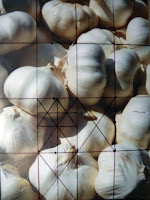
For students who have never drawn, creating a grid is one useful way to help you determine size, angle, and foreshortened relationships and perspective. If working from a reference, your first step will be to find the right proportion for your enlarged sketch (grid). I do this by laying the reference to the lower left corner of piece of sketch paper (large enough to fit your working surface). Draw a diagonal from the lower left corner to the top right corner. Any place on this diagonal that you draw 2 perpendicular lines, the rectangle will be proportional to your reference. This is the area you will use as your format for the larger painting and the area that will correspond to your grid.
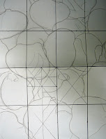
Admittedly, there are many ways to make a grid. I will typically divide the paper and reference in half, 1/4 point and 3/4 point both vertically and horizontally. The one rule... the grid should be the same in both your reference and your enlarged paper. You can further divide you grid as many times as necessary. My goal here is to simply create an accurate line drawing to work from while painting. I will often revise my drawing as I go to fit what works for the painting. Most of the drawing is done with value and form in pastel. However, if my initial proportions are off, then I will never be able to accomplish what I want with value and form. Tip: I will place my reference in a sheet protector and create the grid on the plastic with a sharpie. This way, I can take the photo out later and see it without the distraction from the grid.
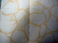
Once I have a drawing I am confident in, I will turn the paper over, cover the lines with graphite (for a watercolor) or hard pastel. Then I will lay the sketch paper over my painting surface (pastel side down) and retrace my initial sketch. Only the pastel sketch will be left on the surface and I am ready to start, almost...