As an artist, one of my tasks in creating a painting is to simplify and translate the essence of a subject as I see it in that moment on any given day. During my pastel workshop this week, we had a discussion on "simplifying," and as one of my students aptly stated "creating a visual summary". The concept seems "simple" enough. However, beginning painters often become distracted with and jump right into painting the details, forgetting that value and form are the "batter and cake" in a painting; essential for it's foundation, success, and "readability".

So, a few tools and questions I use to know what "detail" to include in my visual summary: 1. Begin with a thumbnail sketch. Value sketches are useful in helping you simplify your design into only shape, value and form. 2. Squint your eyes and look at your image. The values in shape and form are the "cake", everything else just "frosting". 3. Which details (usually line or texture) are important to enhance the visual flow and underlying compositional structure? 4. Is the detail important to overall "readability" of the painting? If not, I leave it out. 5. Much of painting is illusion and "special effects". I will often hint at the detail (usually with texture, a few gesture lines, or direction of the pastel application) without actually drawing it in; the viewer's eyes will fill in the rest. For example: in my garlic painting, I use the line of shadow shapes to create movement and flow, visually directing the viewer through the painting ("readability"). The trapped areas of detail and texture (which are really, just less blended areas) at the buds of the garlic also direct (and pause) visual movement. My goal... to support the underlying armature (see previous posts).
 Each year the studio and associate artists at The Workhouse help with a fundraising event called the Collector’s Showcase. I am inviting you to attend this event on December 12, 2009 and help me support the Workhouse and all of its programs. Art collectors and patrons buy a $150 ticket to the event where they enjoy wine tasting, music and best of all they get to select an original piece of artwork and take it home from a collection of over 100 pieces that have been donated by artists at The Workhouse.
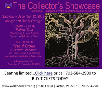
 Pelican Party up for auction for a $150 ticket!

