 Abundance
Pastel on Pastelbord
18X24
Abundance I continue to greatly admire those artists that can prop an easel in a field for hours and paint, or those who can perfectly stage a still-life painting and work for weeks from the same still life (and I have done so myself many times), but admittedly for me, working from "life" and "en plein air" is highly impractical to my process. Honestly, if I set a crate of apples out for 2 weeks to paint them, they would get knocked over during "hide-and-seek" and rearranged and eaten by my children on the first day (ok, maybe the second). I am proud to say, that I am a studio painter who works from my own photographic references. For if I weren't working from a photo-derived inspiration, in the bits and pieces of time I do find to paint; between being a mom, a nurse and the magician who maintains "good order and discipline" at home, I wouldn't paint.
 It might take me a month to finish each, but for weeks, I won't have that unsettling feeling of being between paintings...that short time before the beginning of a new work, where I am idol in planning, allowing time for indecision and self-doubt. I am content in the day knowing just where to start and what to work...no time for dilly-dally.
 What could possibly be the same about these two paintings?... repetition of shape and pattern and trapped dark spaces... we'll see how it all works out...in 2010.
.jpg) In the midst of the season's bustle...pressure for "small works," never-ending holiday demands, countless distractions and set-backs... I am driven to embrace a recently discovered statement (and very fundamental declaration). "If I never sell another painting, win another award, or get accepted into another exhibit, I will paint". I am reminded that something much deeper motivates me and there is a purpose to the work that fills my life (and fellow artists). Whether art serves as a language to communicate with the observer, or as a form of escape from everyday demands, or simply the realization that art is an important aspect in our common humanity, we... I ...feel better having art in our lives.
In the midst of the season's bustle...pressure for "small works," never-ending holiday demands, countless distractions and set-backs... I am driven to embrace a recently discovered statement (and very fundamental declaration). "If I never sell another painting, win another award, or get accepted into another exhibit, I will paint". I am reminded that something much deeper motivates me and there is a purpose to the work that fills my life (and fellow artists). Whether art serves as a language to communicate with the observer, or as a form of escape from everyday demands, or simply the realization that art is an important aspect in our common humanity, we... I ...feel better having art in our lives.
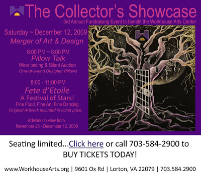 Each year the studio and associate artists at The Workhouse help with a fundraising event called the Collector’s Showcase. I am inviting you to attend this event on December 12, 2009 and help me support the Workhouse and all of its programs. Art collectors and patrons buy a $150 ticket to the event where they enjoy wine tasting, music and best of all they get to select an original piece of artwork and take it home from a collection of over 100 pieces that have been donated by artists at The Workhouse.
 Pelican Party up for auction for a $150 ticket!
 As I work, I am continuing to balance the variety of "warm and cool" color along with considering value and color perspective as I define the forms and space: lighter values, intensity of color, and warmth appear forward; darker values and cool colors visually recede. I also enjoy the interplay of lost and found edges that contribute to the illusion of "real" and aid the viewer's eye to travel around the painting.
 For this "breath of fresh - garlic", I have chosen a neutralized complimentary color scheme of "oranges" and "blues". Considering color harmony, I will keep my palette simple, choosing only a few colors within my color scheme that represent a variety in value (lights, darks, and midtones), softness, temperature (warm and cool colors) and chroma (intensity).
 .jpg) Form and value in painting are built by layering pastel of various hues and color temperature. Most often, I will work spatially, working an area as it occurs in space on the 2D plane. I begin with the most distant space and work towards the most forward space. That said, I continuously go back and make minor adjustments to previously worked areas to balance the colors and values throughout the painting. In general within these spaces, I work from dark to light and harder to softer pastel.
Form and value in painting are built by layering pastel of various hues and color temperature. Most often, I will work spatially, working an area as it occurs in space on the 2D plane. I begin with the most distant space and work towards the most forward space. That said, I continuously go back and make minor adjustments to previously worked areas to balance the colors and values throughout the painting. In general within these spaces, I work from dark to light and harder to softer pastel..jpg) Studying the light as it falls on the subject, I first lay in the darker and "cooler" color followed by the warmer darks. I consider this the foundation darks, followed by the lighter, softer color "on top". By accurately portraying these values, form and depth are created (and thus the "special effects" of painting).
Studying the light as it falls on the subject, I first lay in the darker and "cooler" color followed by the warmer darks. I consider this the foundation darks, followed by the lighter, softer color "on top". By accurately portraying these values, form and depth are created (and thus the "special effects" of painting).  A few tips for thumbnail sketching: Keep your sketches small and simple. They should only take about 5 min each to complete. Don't worry about details, just focus on a pleasing arrangement of shapes and values. Above, I am generalizing mass areas and identifying the areas of lights and darks. I ask myself...Do I want to follow a design structure (or armature) for my painting? Where are the areas of lightest lights and darkest darks? How can I use these shapes to enhance the design of my painting? How will I use these lights and darks (and line direction) to create movement in the painting? How will the viewer's eyes travel around the painting (passage)? Do I have (and want) a focal point?
 One of the most exciting aspects of painting for me is finding order in apparent randomness, especially in life and snapshots of everyday moments. For this reason, I don't "stage" my still-life paintings. I find order in what is already there. For example, the garlic above was a photo from the farmer's market near my studio in Fredericksburg. Armatures serve as the backbone structure of a painting, will help create a coherent flow, and are a starting point to determine placement of shapes, values, and color. The disclaimer here... not all paintings need to have a structure to be successful and not all compositions lend themselves to structure (i.e. single-object still life, continuous field compositions, portraits, etc), but many do. Above are a few common compositional structures. Again, these structures are simply guides, not rules, and for beginning painters, will provide a direction in helping you organize and be more successful with your paintings.
  For students who have never drawn, creating a grid is one useful way to help you determine size, angle, and foreshortened relationships and perspective. If working from a reference, your first step will be to find the right proportion for your enlarged sketch (grid). I do this by laying the reference to the lower left corner of piece of sketch paper (large enough to fit your working surface). Draw a diagonal from the lower left corner to the top right corner. Any place on this diagonal that you draw 2 perpendicular lines, the rectangle will be proportional to your reference. This is the area you will use as your format for the larger painting and the area that will correspond to your grid.
 Admittedly, there are many ways to make a grid. I will typically divide the paper and reference in half, 1/4 point and 3/4 point both vertically and horizontally. The one rule... the grid should be the same in both your reference and your enlarged paper. You can further divide you grid as many times as necessary. My goal here is to simply create an accurate line drawing to work from while painting. I will often revise my drawing as I go to fit what works for the painting. Most of the drawing is done with value and form in pastel. However, if my initial proportions are off, then I will never be able to accomplish what I want with value and form. Tip: I will place my reference in a sheet protector and create the grid on the plastic with a sharpie. This way, I can take the photo out later and see it without the distraction from the grid.
 Once I have a drawing I am confident in, I will turn the paper over, cover the lines with graphite (for a watercolor) or hard pastel. Then I will lay the sketch paper over my painting surface (pastel side down) and retrace my initial sketch. Only the pastel sketch will be left on the surface and I am ready to start, almost...
 Did you know- a little sunflower trivia? Wild sunflower seeds are adapted for living and can remain viable for as long as 10 years. Sunflowers are also eager to cross species and form hybrids. A bee transferring pollen from one species of sunflower to another could be unwittingly creating a new hybrid by swapping genes. Forming these unions is how sunflowers can spread and thrive in extreme environments, like salt marshes and sand dunes. Ornamental and industrial breeders take advantage of this pliant attitude to create new colors, sizes, oil content and seed size. A domestic sunflower is also known to sometimes bend to make contact with its own pollen, where it self-pollinates.
 the poppy
 I found this type of continuous field composition very difficult to organize into some structure. Which I guess is the point...why would I need to "organize" continual movement? My desire to classify everything into some visual order is a concept very hard for me to push aside when painting. And yet, I probably breathe the easiest, when seeing a subject too grand to classify: millions of leaves and dappled light in the forest, endless water in a seascape, thousands of wildflowers. In the presence of grandeur, the eyes rest and the spirit is quiet.
 My intention at this early stage...simply to capture the perpetual movement of the water. My next challenge, organizing the movement.
 We're Going on a Bear Hunt
 If you ever, ever, ever
  The Space Between
 Last October, just for fun, I joined a project hosted by the Art House Coop in Atlanta, Georgia. The concept... 10,000 people would receive a mystery word in the mail and then create a piece of art using that word as inspiration. I was intrigued by the idea, potential, and possibilities. Then I received the word...
 As part of the Torpedo Factory's 35th anniversary celebration, Target Gallery presents From There 2 Here, an exhibition featuring artwork from three regional art centers that were inspired by the Torpedo Factory's groundbreaking concept. The participating art centers (including LibertyTown) are similar in design to the Torpedo Factory in that they have open studios and galleries inside of re-purposed architectural spaces. LibertyTown was an old plumbing supply warehouse in Fredericksburg converted to 30 or more unique studio and gallery spaces by the vision of Dan Finnegan.
  My Pelican Party was chosen for the exhibit and will be on display in the Target Gallery in Alexandria, Virginia from September 10th- October 18th. The gallery will hold an artist's reception September 10th from 6-8PM.
 "We fritter away our lives with detail...simplify, simplify." Henry David Thoreau
 That statement describes my life well and is easy to recognize but difficult to do [in a painting].
 My challenge... simplify the figures as somewhat abstract shapes, use value and color to describe light and dark forms, vary the "lost and found" edges to give the illusion of depth and light, and connect shadow shapes to create unity.
 My realization... the subject doesn't really matter, the principles are the same.
 I found out this week that I have been selected to have 2 full pages of work published in the next volume of Best of America: Pastel; along with many very noteworthy artist and artwork. Funny how self confidence (or lack of) and fear of rejection can sabotage great opportunities; I chickened out entering the watercolor edition after seeing the work chosen for last year's edition. Good thing I didn't look at the work in the pastel category before entering.
 I am thrilled to have this painting accepted into the Shades of Pastel National Competition. The juror for this show is Richard McKinley, a nationally-recognized master pastelist. I took a bit of a gamble entering, and only entered one painting. Usually, I think jurors look for groups of work that are mature and cohesive and then select one or two to show. I had finished this painting just in time to enter, but really no others like it at the time. The exhibit is hosted by the Maryland Pastel Society and will run September 26th to November 7th at the Strathmore Mansion in Bethesda Maryland. Opening Reception will take place on October 4th from 1-3PM.
 1. It is impossible to be toooo silly.
 2. 6 and 7 year olds love to smile and laugh.
 3. Children have wonderful imaginations. Want to know all the possibilities of creating a map collage (and what to do with it)? Ask a 6 year old.
 4. Plan plenty of "extension" activities. Art exploring can be very exciting.
 5. It is physically impossible for 6, 7, & 8 year olds to sit still, not talk and giggle, draw silly faces, and not skip. Something like "exploding heads" may result.

art+opening+8-10-09.jpg) Wine well deserved.
Wine well deserved. Thank you to all the art patrons in Fredericksburg (and Stafford) for your support! Now onto art camp for eleven 6-8 year olds, Yikes! Did I really plan both of these activities in the same week?
 Full Glory
 The posters are up, cards mailed, most of the artwork done (except for a little varnishing, framing, and a few small details), and we have an article "Applause" on page 3 in Fredericksburg's Front Porch Magazine. Maybe I can catch my breath before the Opening August 10th.
 A light exists in spring
 Toward the end of a painting (before I start the next one), I am the most unsettled in my life in art. For so long I suppressed the creative spark I felt since childhood. Life just happens and we become so focused on our daily responsibilities. I guess I still hold a little fear that a lag in creativity will stifle that energy. So I am usually about 2-3 (sometimes 5 or 8) paintings behind (at least in my mind). Though reason says I should really take a break after such a long stretch of painting, I am eager to begin and settle into the comfort of the next painting. A little fear of idleness pushes me on.
 Making progress... This should be my last painting to complete before the show in August. I can see the light...


